← Back to Portfolio
Excel KPI Project Operations Analytics Statistical Testing Dashboard Reporting

Operations Management Analysis

A complete operations analytics project built in Microsoft Excel and Word to evaluate manufacturing KPIs, analyze delivery performance, compare transmission costs across processes, and assess employee retention patterns. The work moves from raw data to validated statistics and finishes with decision-ready recommendations for management.

5
Years
KPI history from 2014–2018
3
KPI Areas
Delivery, cost and retention
3
Processes
Current, Process A and Process B
95%
Confidence Level
Hypothesis tests at α = 0.05
2
Statistical Tests
Proportion test and ANOVA
Excel Dashboards · KPI Modeling Statistical Analysis · ANOVA · Proportion Tests

Project overview

This senior level operations project evaluates how a lawn equipment manufacturer performs on three critical fronts: on time delivery, transmission cost, and workforce retention. Each KPI lives in its own Excel tab, with formulas, charts, and tests linked to a structured narrative.

The analysis compares 2014 and 2018 delivery rates, tests whether alternative processes can reduce unit costs, and highlights demographic retention trends. All insights roll into an 8 page report aimed at giving leadership a clear roadmap for improving operational performance.

The lab mirrors a real operations analyst workflow: organize the data, build KPIs, run tests at a defined confidence level, then translate everything into concrete business recommendations.

What was built

  • Excel workbook with separate tabs for delivery, transmission cost, and retention
  • On time delivery dashboard comparing 2014 and 2018 performance
  • ANOVA based cost comparison across the current process, Process A, and Process B
  • Pivot based retention views segmented by gender and locality
  • Formula driven KPI modeling for proportions, rates, and comparative metrics
  • An 8 page Word report summarizing findings, tests, and recommendations

Workflow Overview

Step 1

Data Import

Loaded delivery, cost, and retention data into structured Excel tabs.

Step 2

Cleaning

Formatted ranges, checked for errors, and validated inputs.

Step 3

KPI Construction

Built delivery percent, unit cost, and retention metrics.

Step 4

Statistical Testing

Used proportion tests and ANOVA to validate differences.

Step 5

Reporting

Summarized insights and recommendations in a formal report.

Lab Breakdown

Dataset overview and workbook structure

The project begins with a multi tab Excel workbook that separates major KPI areas into their own sheets. This layout mirrors how operations teams keep delivery, cost, and retention data organized for recurring analysis.

1.1 — Organizing KPIs into a dedicated workbook

All operational data from 2014 through 2018 lives inside a single workbook. Each KPI category uses its own tab so metrics, charts, and tests never overlap or get mixed together by mistake.

  • Segmented KPIs into On Time Delivery, Transmission Cost, and Retention tabs
  • Labeled ranges clearly so formulas and charts point to consistent data
  • Kept 2014–2018 values aligned across tabs for easier trend comparisons
Workbook Overview

Excel workbook main screen with separate tabs for delivery, transmission cost, and retention.

Key actions in this phase

  • Grouped KPIs into distinct tabs to mirror a real operations workbook
  • Ensured that all 2014–2018 data aligned by period for cross tab comparisons
  • Prepared a structured starting point for delivery, cost, and retention analysis

On time delivery analysis and hypothesis test

This portion of the lab focuses on whether on time delivery performance genuinely improved between 2014 and 2018. The analysis combines trend visualization with a one sample proportion test at the 95 percent confidence level.

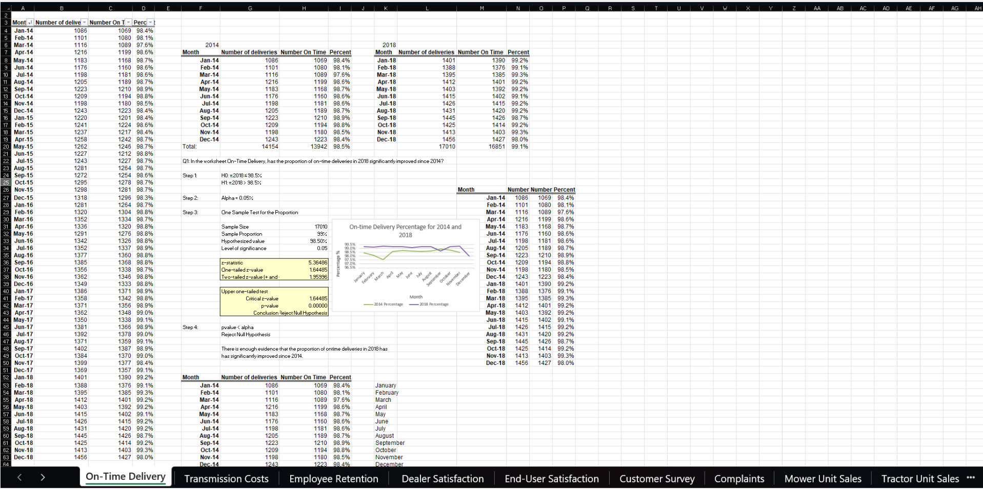
2.1 — Visual comparison of delivery trends

A line chart compares monthly on time delivery rates for 2014 and 2018. This makes it easy to see seasonal dips, recovery periods, and the overall shift in consistency as operations improved.

  • Plotted 2014 and 2018 delivery percent side by side by month
  • Identified months where 2018 significantly outperformed the earlier year
  • Used the chart as a visual anchor before running formal tests
On-Time Delivery Chart

Monthly delivery comparison for 2014 and 2018, showing seasonal patterns and overall improvement.

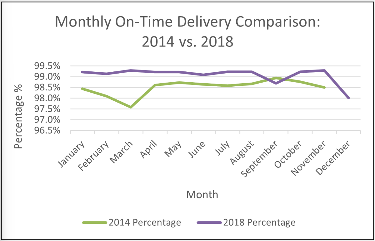
2.2 — Proportion test at 95 percent confidence

A one sample proportion test verifies that the higher 2018 delivery rate is not just noise. The test uses a 5 percent significance level, aligning with standard business analytics practice.

  • Calculated the observed delivery proportion for 2018
  • Computed the test statistic and p value using standard Excel functions
  • Rejected the null hypothesis, confirming a significant improvement
Proportion Test Results

Proportion test results confirming that 2018 on time delivery improved significantly at α = 0.05.

Key actions in this phase

  • Built a clear visual comparison of 2014 versus 2018 delivery performance
  • Applied a one sample proportion test at the 95 percent confidence level
  • Confirmed that the observed improvement in on time delivery is statistically meaningful

Transmission cost comparison and ANOVA

This phase evaluates whether unit transmission costs differ across the current manufacturing process, Process A, and Process B. The analysis uses both visual comparison and a one way ANOVA to identify the most cost efficient option.

3.1 — Visual comparison of unit costs

A bar style chart displays unit transmission costs for each of the three processes. The visual immediately highlights that Process A tends to sit at the lower end of the cost range.

  • Plotted unit cost observations for the current process, Process A, and Process B
  • Used the chart to spot differences in both average level and variability
  • Identified Process A as a visually strong candidate for lowest cost
Transmission Cost Comparison Chart

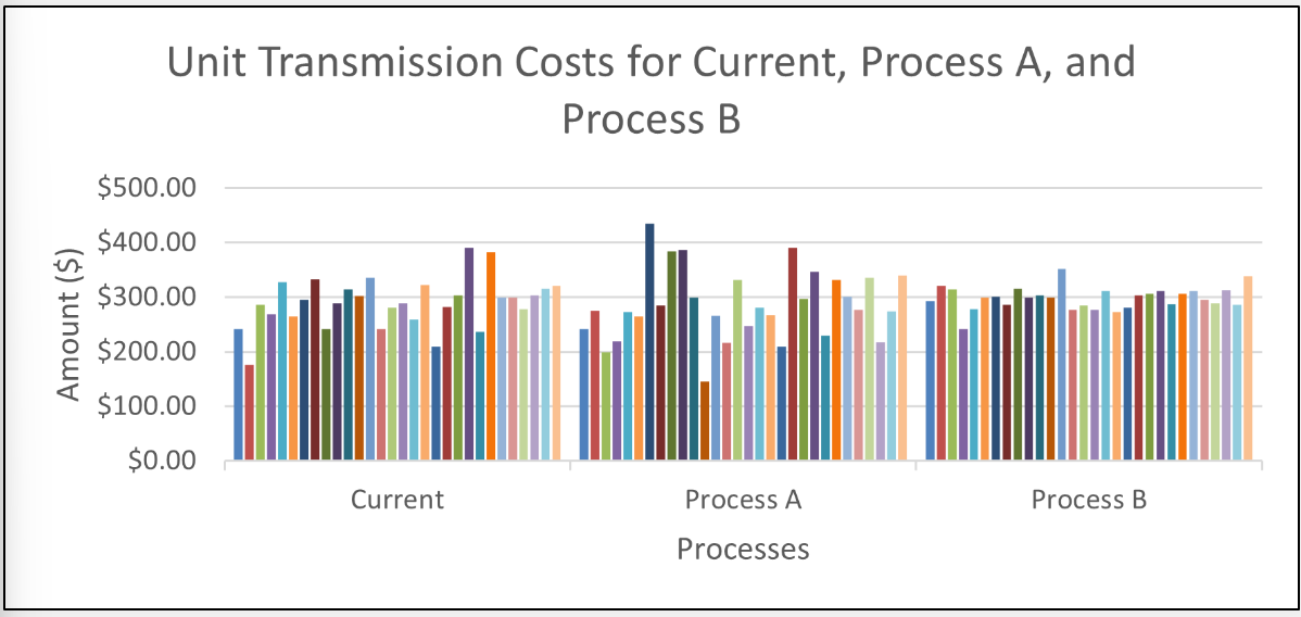
Unit transmission cost comparison across the current process, Process A, and Process B.

3.2 — One way ANOVA with Excel ToolPak

A one way ANOVA quantifies whether at least one process differs in mean cost. The test uses the Data Analysis ToolPak and reports summary statistics, the F statistic, the critical F value, and the p value.

  • Structured the data into ToolPak friendly ranges for each process
  • Ran a one way ANOVA to compare mean transmission costs
  • Interpreted the p value to confirm statistically significant differences
ANOVA Results for Transmission Costs

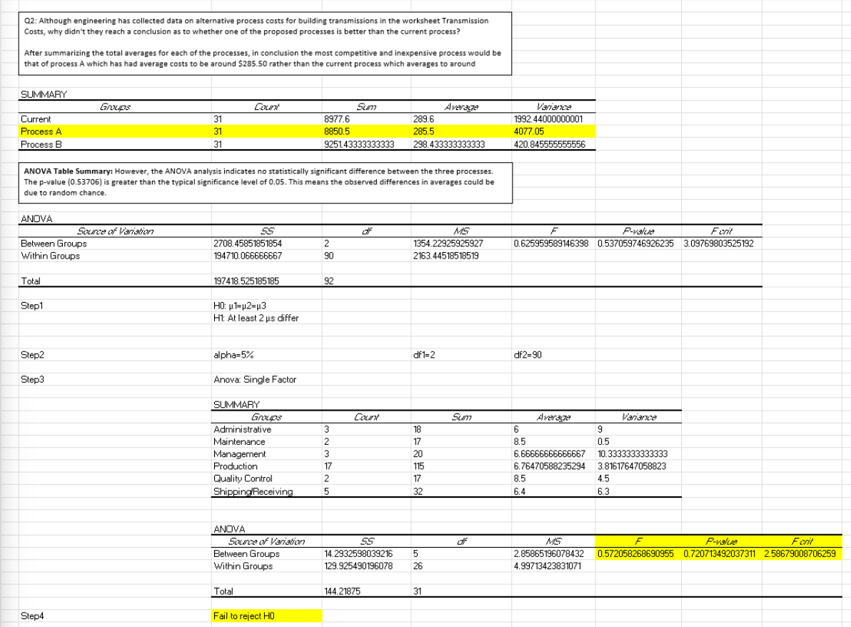
ANOVA output confirming statistically significant cost differences across processes.

Key actions in this phase

  • Compared unit transmission costs visually across three manufacturing processes
  • Used a one way ANOVA to formally test for mean cost differences
  • Identified Process A as the most cost efficient option based on both charts and statistics

Employee retention by gender and locality

The retention analysis explores how stable the workforce is across demographic segments. Excel pivot tables and charts reveal which groups stay longer and where HR might want to focus targeted strategies.

4.1 — Visual retention breakdown

A bar chart summarizes retention counts by combinations of gender and locality. This view quickly highlights which segments show stronger or weaker retention.

  • Built a pivot table to count retained employees by demographic segment
  • Visualized the counts to highlight stronger and weaker retention groups
  • Used the chart as an entry point for HR oriented discussion
Employee Retention Chart

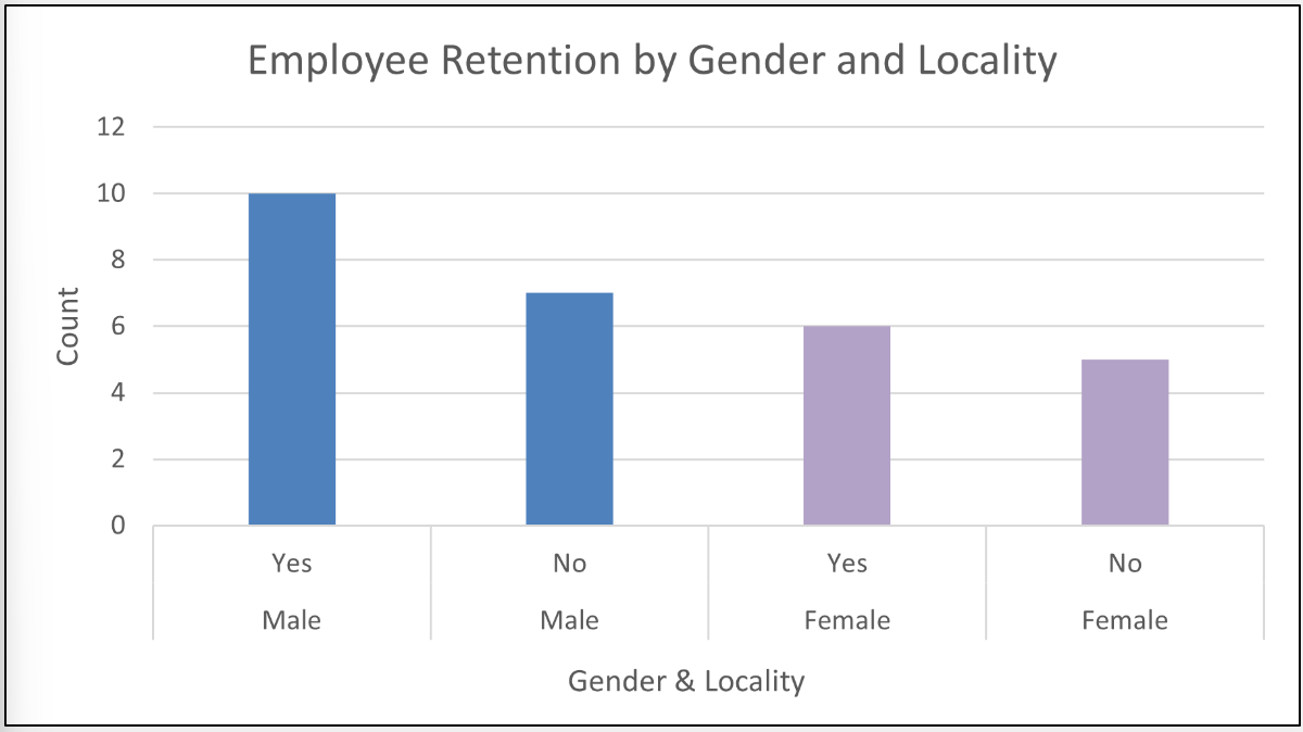
Retention breakdown by gender and locality, highlighting key demographic patterns.

4.2 — Underlying counts and stability

The underlying table confirms exact counts for each group and ensures the chart accurately reflects the data. Differences are visible but not extreme, suggesting generally stable retention across segments.

  • Reviewed raw counts for each gender and locality combination
  • Verified that chart values match the summarized table
  • Noted that most differences are modest rather than extreme outliers
Employee Retention Table

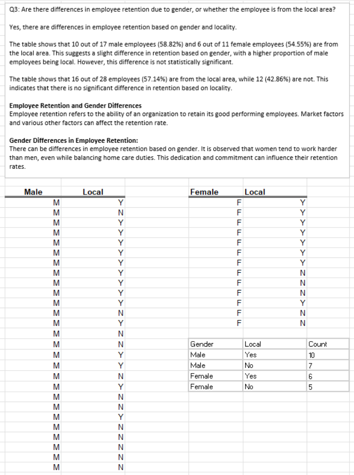
Retention counts summary table used to compare and validate demographic segments.

Key actions in this phase

  • Used pivot tables to segment retention data by gender and locality
  • Visualized retention counts to highlight where turnover might be higher
  • Confirmed that differences across demographic groups are present but generally modest

Key Excel formulas and modeling approach

Behind the charts and tests, the workbook relies on standard Excel functions to calculate KPIs, filter data, and support the formal hypothesis tests. This tab highlights representative formulas used throughout the lab.

Conditional count

=COUNTIFS(A:A, "Complete", B:B, ">"&DATE(2018,1,1))
              

Counts all entries marked Complete that occurred after January 1, 2018. Used to filter valid events across a specific time range when building delivery related KPIs.

Retention percentage

=SUMIFS(Retained, Gender, "F") / SUMIFS(Employed, Gender, "F")
              

Calculates the retention rate for female employees by dividing those retained by the total number employed in the same demographic segment.

Statistical support functions

While the ANOVA and proportion test outputs rely on the Data Analysis ToolPak, the supporting calculations use familiar Excel functions to compute proportions, z scores, and summary metrics.

  • Proportion based calculations built from basic division and sample size checks
  • Data validation ranges to ensure only valid periods feed the tests
  • Helper columns that standardize inputs to the ToolPak procedures

Key actions in this phase

  • Documented the most important Excel formulas behind the KPIs and tests
  • Connected the formula layer to the visual dashboards and statistical outputs
  • Showed how standard Excel functions support a complete operations analysis workflow

Analytical Structure

Core Tools and Methods

  • Excel modeling for KPI creation and comparison
  • One sample proportion testing for delivery improvements
  • One way ANOVA to compare unit transmission costs
  • Trend visualization through charts and dashboards
  • Formal report writing to present findings to management

Analysis Flow

  • Import and clean raw operational data
  • Build KPIs for delivery, cost, and retention
  • Run proportion tests and ANOVA at α = 0.05
  • Create dashboards that highlight patterns and outliers
  • Translate results into a decision ready narrative for leaders

Key insights

  • Delivery performance improved significantly between 2014 and 2018, confirmed by a 95 percent confidence proportion test
  • ANOVA showed that Process A has the lowest average transmission cost, supporting a shift toward this process
  • Seasonal patterns in delivery revealed periods where staffing and inventory planning can be adjusted for better performance
  • Retention analysis highlighted demographic segments worth closer HR attention while confirming overall workforce stability

Skills demonstrated

Excel Modeling KPI Analysis Statistical Testing (ANOVA) Proportion Tests Dashboard Reporting Operational Analytics Data Cleaning and Validation

Summary

This operations management lab turns a multi year set of manufacturing KPIs into a clear, statistically backed story. By separating delivery, transmission cost, and retention into focused Excel tabs, then applying proportion tests and ANOVA at a 95 percent confidence level, the project surfaces where performance has truly improved and where further optimization is available. The final deliverables combine Excel models, visual dashboards, and a structured written report. Together they demonstrate the full workflow expected of an entry level operations or business analyst: clean the data, build the metrics, validate with statistics, and communicate recommendations in plain language.